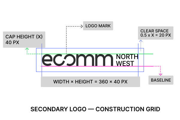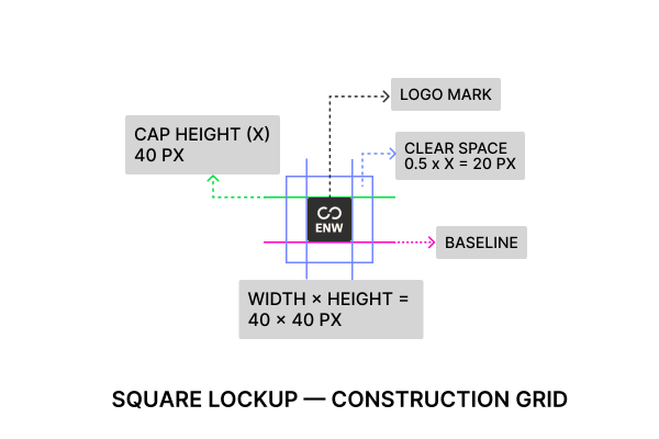

ecomm Northwest linked logo mark

Northwest
by Brand

The ecommerce Northwest Brand Guide

A practical brand book for applying the identity with clarity: foundations, logo, palette, typography, voice, buttons, icons, and real-world brand applications for an ecommerce founder community.

Foundations

The ground rules for how ecomm Northwest speaks, behaves, and shows up: clear, useful, human, practical, and built around the people moving ecommerce forward.

Scroll down ↓
01

About
ecomm Northwest

ecomm Northwest is a community built for the people behind the brands — founders, operators, and marketers driving digital growth across the Pacific Northwest.

We're not about hype or gatekeeping; we're about real stories, actionable insights, and connections that last.

From casual meetups to hands-on events, we create space for ecommerce builders to learn from each other and grow together.

02

Brand Purpose
& Mission

Why we exist:

To connect and empower ecommerce operators and brand builders by sharing honest experiences, practical knowledge, and the momentum that comes from community.

Our mission:

To be the catalyst that meets people where they are, sparks meaningful connections, and helps them take the next step in building resilient, thriving brands.

03

Personality

ecomm Northwest carries the energy of a sharp, grounded peer — steady, honest, and practical, with a spark of curiosity that keeps us moving forward. We're resourceful and resilient, always ready to adapt, and we bring a sense of momentum and collaboration to everything we do.

Northwest grounded
Perpetually curious
Resilient, resourceful
Practical insight
Energizing colleague
04

Values

Our community thrives on clarity, usefulness, and connection. We share applied knowledge instead of theory, lift others as we grow, and celebrate the people behind every brand. Progress here is built on trust, collaboration, and the belief that when one of us succeeds, we all rise.

Truthful, No-BS
Applied Knowledge
Collaborative Spirit
Celebrate People
Grow Together
05

Brand
Narrative

ecomm Northwest is for the individuals behind the logos — the founders, operators, and marketers driving ecommerce forward.

We're here to support them, grow their skills, and build meaningful connections that last beyond any single role.

Together, we celebrate the incredible brands that call the Northwest home and the people who make them thrive — because when individuals succeed, the whole region rises.

It's not a stage. It's a catalyst.
And it stays with you long after the event ends.
06

Vision

To be the go-to ecommerce community in the Pacific Northwest — known for real stories, real outcomes, and the spark that drives brand builders to lasting success.

Foundation system

Brand
Pillars

Four distinct pillars define how ecomm Northwest shows up, communicates, and designs. They are rooted in the Pacific Northwest spirit, practical knowledge, and the drive to build a collaborative community.

Scroll down ↓
01

Rooted
Sophistication

Northwest grounded · Resilient · Practical insight · Real
We are

Grounded in the Pacific Northwest: resilient, resourceful, and shaped by practical insight. Our work reflects long-term thinking, enduring value, and growth that happens together as a community.

What this guides
  • Primary colors lean into natural textures: deep maroons, timber browns, and grounded neutrals.
  • Titles and display text use Epilogue, backed by restrained Source Serif copy.
  • Layouts stay calm and exact, avoiding decorative noise.
How to demonstrate
  • Use visuals that feel real and grounded.
  • Let the primary palette and type hierarchy carry confidence quietly.
  • Use generous spacing and thoughtful hierarchy.
02

Clarity with
Backbone

Truthful · No-BS · Applied knowledge · Tactical
We are

Straightforward, useful, and tactical. We communicate in a way that is direct, confident, and easy to trust.

What this guides
  • Foglight Cream gives clarity and separation.
  • Charcoal Bark carries contrast and legibility.
  • Typography is direct: clear body copy and structured mono labels.
How to demonstrate
  • Keep layouts open, direct, and easy to scan.
  • Support expressive moments with a calm structural base.
  • Present content in practical, digestible formats.
03

Curated
Connectedness

Collaborative spirit · Celebrate people · Intentional community
We are

A brand that brings people together with purpose. The connection should feel shaped, warm, and human.

What this guides
  • Canyon Ember, Lake Slate, Sunblush Petal, and Tide Clay support moments of community energy.
  • Quick quotes, callouts, and people-first storytelling create warmth.
  • Events and speaker moments should feel personal before they feel promotional.
How to demonstrate
  • Use candid but intentional photography.
  • Highlight shared focus, real expression, and collaboration.
  • Avoid generic broadcast visuals where intimacy matters.
04

Energetic
Intelligence

Dynamic wit · Light, rhythmic · Perpetually curious
We are

Always moving with purpose, timing, and clarity. Our energy is thoughtful, not random, and designed to make the brand easier to remember.

What this guides
  • Canyon Ember and Lichen Glow guide motion, highlights, and high-energy cues.
  • Microinteractions should feel sharp, smooth, and intentional.
  • Editorial energy comes through rhythm, pull quotes, and smart sequencing.
How to demonstrate
  • Use warm action cues for starts, shifts, and directional highlights.
  • Introduce earned visual surprises with restraint.
  • Make every movement serve clarity and understanding.

Colors

The palette reflects the soul of ecomm Northwest: grounded in the Pacific Northwest, balanced by calm clarity, and supported by sparks of action and connection.

Scroll down ↓

Colors:
The Why

We're not just one color because ecomm Northwest is not one story. It is a community, not a brand campaign. The palette helps the people we champion — makers, operators, and builders across every corner of ecommerce — feel considered and connected.

  • Primary colors are rooted and structural, anchoring layouts and establishing trust.
  • Secondary colors provide warmth and balance to the system.
  • Accent colors bring life and motion, used sparingly to guide focus and interaction.
  • Neutrals and backgrounds create space for clarity and legibility.
01

Primary
Colors

Core visible surfaces · key touchpoints

Our primary colors form the core visual foundation of the brand, defining the most visible surfaces and key brand touchpoints.

  • Soil Maroon (#611C28) – Rich, grounded, and confident; used in headers, anchors, and key visual elements.
  • Deep Timber (#35545D) – Calm, structural, and trustworthy; forms the backbone for key UI components and dark surfaces.

Usage:

  • Logos, headers, callout sections
  • Structural elements like nav bars and dividers
  • Works best in combination with neutral backgrounds
#611C28AAA
Soil Maroon
The Brooding Storyteller: Broody, dramatic, and secretly a romantic.
Launch | AAA
Take flight with your idea.
Launch | AAA
Take flight with your idea.
Launch | AA
Take flight with your idea.
Launch | AAA
Take flight with your idea.
#35545DAAA
Deep Timber
The Quiet Anchor: Quiet, loyal, and secretly judging your spending.
Sell | AA
Carts filled, dreams built.
Sell | AA
Carts filled, dreams built.
Sell | AA
Carts filled, dreams built.
Sell | AA
Carts filled, dreams built.
02

Secondary
Colors

Warmth · approachability · quiet structure

Secondary colors support and complement the primary palette, bringing warmth and approachability.

  • Lichen Glow (#D7D334) – Subtle spark of energy and curiosity
  • Tide Clay (#B3A793) – Muted, balancing warmth for softer surfaces

Usage:

  • Section highlights, info panels, and subtle CTAs
  • Typographic highlights or secondary buttons
  • Background panels where softer tone is needed
#D7D334AAA
Lichen Glow
Restless spark: The extrovert of the forest, impossible to ignore.
Scream | AAA
Be loud. Be unforgettable.
Scream | AA
Be loud. Be unforgettable.
Scream | AA
Be loud. Be unforgettable.
Scream | AA
Be loud. Be unforgettable.
#B3A793AA
Tide Clay
Warm mediator: Calm on the outside, greedy on the inside.
Build | AA
Stuff dreams inside.
Build | AA
Stuff dreams inside.
Build | AA
Stuff dreams inside.
Build | AA
Stuff dreams inside.
03

Accent
Colors

Motion · attention · interactive states

Accent colors bring motion and attention, guiding users to actions, highlights, and interactive states.

  • Canyon Ember (#E4572E) – High-energy, human-centered highlights; ideal for primary buttons and tags.
  • Lake Slate (#6175B0) – Calming blue accent for links, data visuals, and context highlights.
  • Sunblush Petal (#FFB3C7) – Soft expressive pop for event visuals, community highlights, or hover states.

Usage:

  • Buttons, tags, hover states, and interaction cues
  • Pull quotes or testimonial highlights
  • Visual storytelling moments (e.g., event posts, speaker intros)
#E4572EAA
Canyon Ember
Bold firestarter: Fearlessly chasing the spotlight.
Hustle | AA
Your store, your rules.
Hustle | AA
Your store, your rules.
Hustle | AA
Your store, your rules.
Hustle | AA
Your store, your rules.
#FFB3C7AAA
Sunblush Petal
Playful Romantic: Soft, flirty, and endlessly clingy.
Love | AA
Heart it. Obsess over it.
Love | AA
Heart it. Obsess over it.
Love | AAA
Heart it. Obsess over it.
Love | AA
Heart it. Obsess over it.
#6175B0AA
Lake Slate
Calm thinker: Calm, cool, and 70% mysterious.
Drift
Hover everywhere. Judge silently.
Drift
Hover everywhere. Judge silently.
Drift
Hover everywhere. Judge silently.
Drift
Hover everywhere. Judge silently.
04

Neutrals &
Backgrounds

Breathable space · legibility · balance

Neutral colors keep layouts clean, breathable, and legible, ensuring that expressive moments feel balanced.

  • Foglight Cream (#FFFDF9) – Default page background, keeps visuals light and open.
  • Charcoal Bark (#2F2F2F) – Main text color; anchors typography with high readability.

Usage:

  • Primary and secondary page backgrounds
  • Text, icons, and utility elements
  • White space and visual padding to support other colors
#2F2F2FAAA
Charcoal Bark
Steadfast critic: Dark, stoic, and secretly judging.
Add | AAA
One is never enough.
Add | AAA
One is never enough.
Add | AAA
One is never enough.
Add | AA
One is never enough.
#FFFDF9AAA
Fog Cream
Gentle optimist: Quiet, patient, and low-key persuasive.
Show | AAA
Put it out there.
Show | AA
Put it out there.
Show | AA
Put it out there.
Show | AAA
Put it out there.

Type
with
Backbone

The typography system uses three families with clear jobs: Epilogue leads with force, Source Serif 4 carries the human editorial voice, and Red Hat Mono adds structure for labels, metadata, and utility moments.

Scroll down ↓
00

Typography:
The Why

Choosing the right type was crucial for ecomm Northwest. The system needed enough range for a practical brand book, enough character for a founder community, and enough restraint to stay useful across real applications.

  • Epilogue delivers decisive structure, directness, and visual confidence.
  • Source Serif 4 keeps the voice grounded, editorial, and easy to read.
  • Red Hat Mono gives labels, data, navigation, and rules a technical rhythm.
01

Epilogue

Titles · Display · Buttons · UI statements

Epilogue is the loudest voice in the system. It gives headlines and compact UI statements a firm, contemporary structure without feeling generic or over-designed.

ABCDEFGHIJKLM
NOPQRSTUVWXYZ
abcdefghijklm
nopqrstuvwxyz
0123456789
Web rules
  • Weights: 900 for display, 700 for major section headers, 600 for compact UI headings and buttons.
  • Line height: tight for display, open enough for multi-line headings.
  • Use it for: titles, hero statements, buttons, and short confident calls.
  • Do not: use it for paragraph copy or dense rule text.
Social rules
  • Use larger, bolder Epilogue for message-first posts.
  • Pair with Source Serif 4 when a human note or quote is needed.
  • Keep contrast direct and spacing generous.
  • Avoid decorative effects that weaken the letterforms.
02

Source
Serif 4

Body · Editorial notes · Descriptions

Source Serif 4 brings warmth, depth, and an approachable sense of expertise. It supports long-form reading, brand explanations, and practical guidance without becoming overly formal.

ABCDEFGHIJKLM
NOPQRSTUVWXYZ
abcdefghijklm
nopqrstuvwxyz
0123456789

Real growth needs language that can carry detail without losing rhythm.
Web rules
  • Body Display: 20px for intros and prominent copy.
  • Body 1: 16px for default paragraphs.
  • Body 2: 14px for notes, dense captions, and supporting copy.
  • Keep line heights generous enough for comfortable reading.
Social rules
  • Use Source Serif 4 for proof points, quotes, and short editorial captions.
  • Do not stretch it into headline territory when Epilogue should lead.
  • Use it to make practical guidance feel human.
  • Keep contrast strong on image or color backgrounds.
03

Red Hat
Mono

Utility · Metadata · Navigation · Stats

Red Hat Mono is used sparingly for system surfaces. It adds precision to navigation, tags, metadata, and small labels without replacing the brand's warmer editorial voice.

ABCDEFGHIJKLM
NOPQRSTUVWXYZ
abcdefghijklm
nopqrstuvwxyz
0123456789
Web rules
  • Nav: 12px with minimal tracking.
  • Metadata: 11px to 12px with measured uppercase rhythm.
  • Use for labels, section numbers, specs, and technical notes.
  • Never use it for long paragraphs.
Social rules
  • Use as an anchor for date, section, or context labels.
  • Pair with Epilogue for high-impact headline layouts.
  • Keep it short, structural, and purposeful.
  • Avoid making the brand feel too technical or cold.
04

Type
Scale

Approved web roles · No drift
Display XL
Grow
Epilogue 900
H1
The Path Forward
Epilogue 900
H2
Where the Energy Goes
Epilogue 700
H3
Markets Move
Epilogue 700
Body Display
Creativity is strongest when it is shared, celebrated, and nurtured.
Source Serif 4 20
Body 1
Every collaboration sparks a chain of new possibilities and outcomes.
Source Serif 4 16
Body 2
Use for short captions, post notes, and compact supporting text.
Source Serif 4 14
Metadata
Red Hat Mono 11
05

Examples

Typography in applied brand moments
THE GROWTH FACTOR

Creativity is strongest when it’s shared, celebrated, and nurtured.

Building A
World Where

Every collaboration sparks a chain of new possibilities and outcomes.

Creators Grow
Together

Here, every step forward is a shared victory toward a bigger vision.

The Path Forward
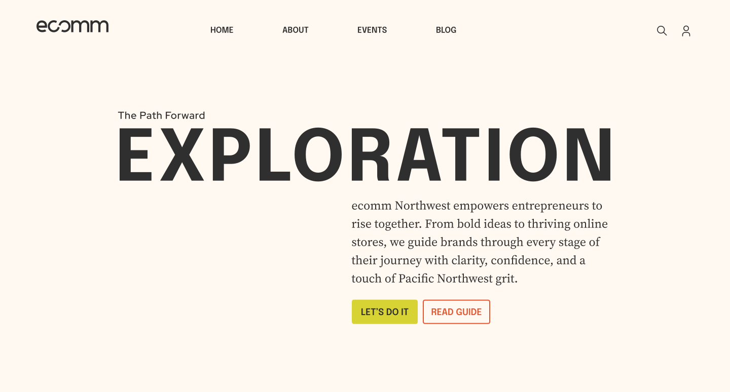
Exploration

ecomm Northwest empowers entrepreneurs to rise together. From bold ideas to thriving online stores, we guide brands through every stage of their journey with clarity, confidence, and a touch of Pacific Northwest grit.

Let’s do it Talk to us

Buttons

Button rules define the action language of the guide: clear labels, stable states, visible arrows, and color pairings that keep every call to action useful.

Scroll down ↓
Buttons · CTA · states

Call-to-Action System

The CTA system creates clear, actionable moments across the ecomm Northwest experience while staying aligned with the broader identity system.

Use the controls to compare light and dark contexts, switch button families, and test hover, focus, inactive, and click behavior in one live preview.

Mode

Primary

Default:Uses Lichen Glow as the fill with Charcoal Bark text.

Hover:Transitions to Lichen Glow Darken 1 while keeping the text color.

Focused:Displays a Charcoal focus ring with a 4px offset.

Inactive:Uses Charcoal Bark Lighten 2 with reduced text contrast and no hover state.

Interaction
Sparks
Connection

Communities grow one step at a time-just like our buttons. Hover, click, and feel how every interaction adds to the bigger picture.

States

| | |
Primary
Button
  • Padding: 16px horizontal, 8px vertical
  • Font: Epilogue Semi-Bold, uppercase, 18px
  • Icon: Arrow, visible in every enabled state

Icons

Icons support recognition without taking over the page. Use the set as a practical layer for actions, statuses, concepts, and community moments.

Scroll down ↓
Guidelines · icons · system

Icons

Icons in ecomm Northwest provide clear, consistent, and brand-aligned communication across the platform. They help users recognize actions, statuses, and concepts without relying solely on text. The icon system is designed for function first, with four types of icons to cover different needs.

Metaphorical Icons

Used for conceptual or functional actions that are visually intuitive but not literal.

  • Examples: Handshake (collaboration), Lightbulb (ideas), Map Marker (events), Flag / Star (highlights, featured content)

Platform-Specific Icons

Custom icons that are unique to ecomm Northwest and reinforce our brand identity.

  • Examples: ecomm and coffee mug, salmon arrow (growth/community), mountain/tree (Pacific Northwest theme)

Core Library Icons

Common interface icons sourced from Font Awesome Solid for consistency and accessibility.

  • Examples: Home, User, Calendar, Chat, Envelope, Bell

Confirmation & Status Indicators

Icons used to communicate success, pending, error, or confirmation states in the UI.

  • Examples: Check (success), Clock (pending), X / Alert (error), Calendar Check (event confirmed)
01

Guidelines

Scale · emphasis

Use larger icons only as brand moments.

When an icon becomes a visual anchor, it can scale up to 60px. Keep the shape simple, high contrast, and paired with enough space to read as intentional.

Container · padding · size

Keep UI icons compact and measurable.

Use a 24px container for interface icons. Keep 8px of internal padding when an icon sits inside a control, and use a 16px glyph when the control is dense.

Buttons · actions

Use icons when they clarify the action.

CTA icons should reinforce direction or intent. They stay visible in every enabled state and should never become the only cue for what the button does.

Sets · consistency

Keep each surface to one icon logic.

Use metaphorical, platform-specific, core interface, and status icons intentionally. Avoid mixing categories in the same UI moment unless the hierarchy is obvious.

Voice

The voice should sound like a sharp peer: grounded, clear, useful, and direct enough to help founders move without hype or over-polish.

Scroll down ↓

How ecomm Northwest Speaks

ecomm Northwest sounds like your sharpest peer - confident, grounded, and focused on real progress. We speak with clarity, not flash. Our voice is built for momentum. Whether we're writing a headline, a caption, or a brand story, the goal is the same: to build trust, create momentum, and speak to people like they're already in motion.

Our voice is shaped by what we believe:

  • People are tired of fluff.
  • Clarity is respect.
  • Progress comes from sharing, not posturing.

Real, Grounded

Steady, honest, practical. We don't hype. We respect people's time and tell the truth.

Do "From 3 abandoned carts to 300 daily sales. Here's how they did it."

Don't "Boost your sales instantly with our proven 10x formula!"

Dynamic Wit

Sharp, light, confident humor. We use wit to energize, not to perform or belittle.

Do "We asked 12 brands what keeps them up at night. Spoiler: It's not the competition."

Don't "Discover how to beat your competitors with our guide."

Light, Rhythmic

Flows naturally, easy to read. Our writing moves quickly, like a conversation that pulls you in.

Do "Early coffee. Late nights. And a few lessons we learned the hard way."

Don't "Learnings from our extensive ecommerce experience."

Clear, Relatable

Human, simple, approachable. We talk like peers, not a press release.

Do "Three things I wish someone told me before I hit launch."

Don't "Launching an ecommerce brand can be challenging, but rewarding."

Tactical, over Theoretical

Actionable and useful. We give people steps they can use today.

Do "Stop guessing your ad spend. Start with this 5-minute check."

Don't "Effective marketing is the cornerstone of ecommerce success."

01

Rules for Writing in the ecomm Northwest Voice

Write Like a Peer

  • Talk to founders and builders like you're in the room with them.
  • Avoid corporate tone, over-polish, or marketing jargon.

Lead with Clarity

  • Make the main takeaway clear in the first line.
  • A scroll-stopping line beats a clever riddle.

Be Useful in Every Line

  • Give readers something actionable or thought-provoking fast.
  • Every post, article, or email should deliver momentum, not just vibes.

Show, Don't Sell

  • Share real stories, lessons, or data over empty promises.
  • Support the community by highlighting what others are doing right.

Keep It Light, but Smart

  • Wit is welcome, but subtle - let sharp insights do the heavy lifting.
  • If it feels like a joke for the sake of a joke, cut it.

Community First

  • Speak in a way that includes, invites, and lifts others.
  • "We" is stronger than "I."
02

Voice Examples

Why some brands thrive while others fade

Securing funding, creating great products, and making sales are all important. But the real challenge? Mattering to people.

To truly connect, a brand must know the unique value it offers, why it stands out, and how to form meaningful relationships with its audience.

It all starts with defining your brand's value proposition.

More Ahead ->

ecommerce founders today have more tools than ever to reach their customers. But knowing where to focus your energy makes all the difference.

Read the Blog ->

Growth Goals

At ecomm Northwest, we believe growth starts with clarity.

Whether you're building your first store or scaling to seven figures, your goals should guide your brand, marketing, and customer experience.

Brand in Action

Application examples show how the system behaves in campaign moments, social posts, website surfaces, and community content without leaving the guide's rules behind.

Scroll down ↓
Applications · live examples · system

Brand in Action

These examples show how the identity behaves outside the rules: in campaign moments, social posts, landing pages, and community content. The system should feel direct, useful, and editorial without becoming cold.

Use scale to create momentum, not decoration.
Pair expressive headlines with grounded body copy.
Let the palette do the work: Charcoal, Fog, Lichen, Timber, and measured accents.
01

Campaign
Moments

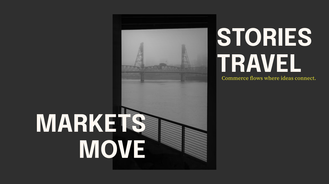
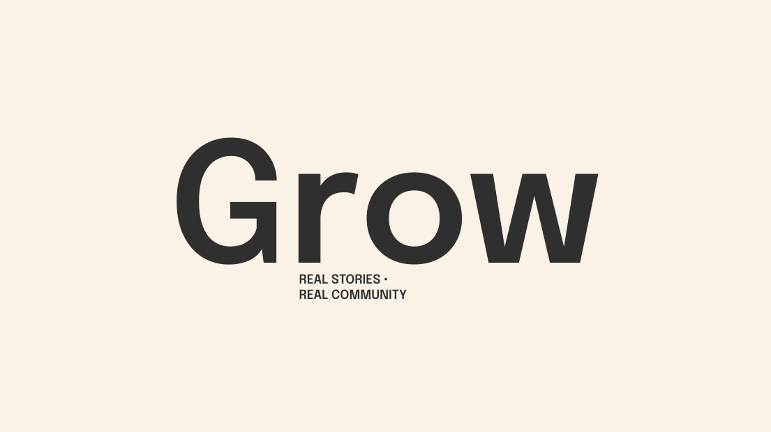
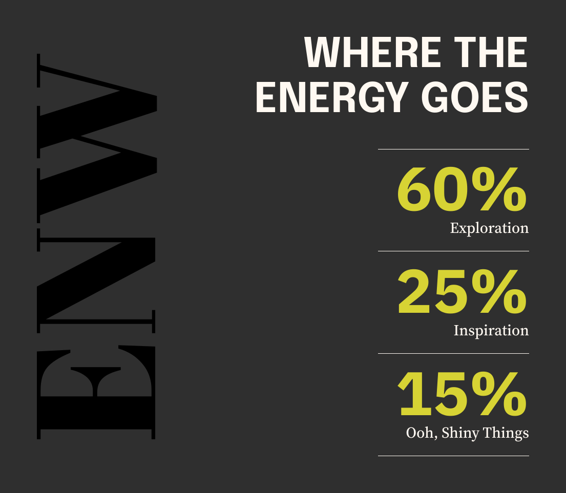
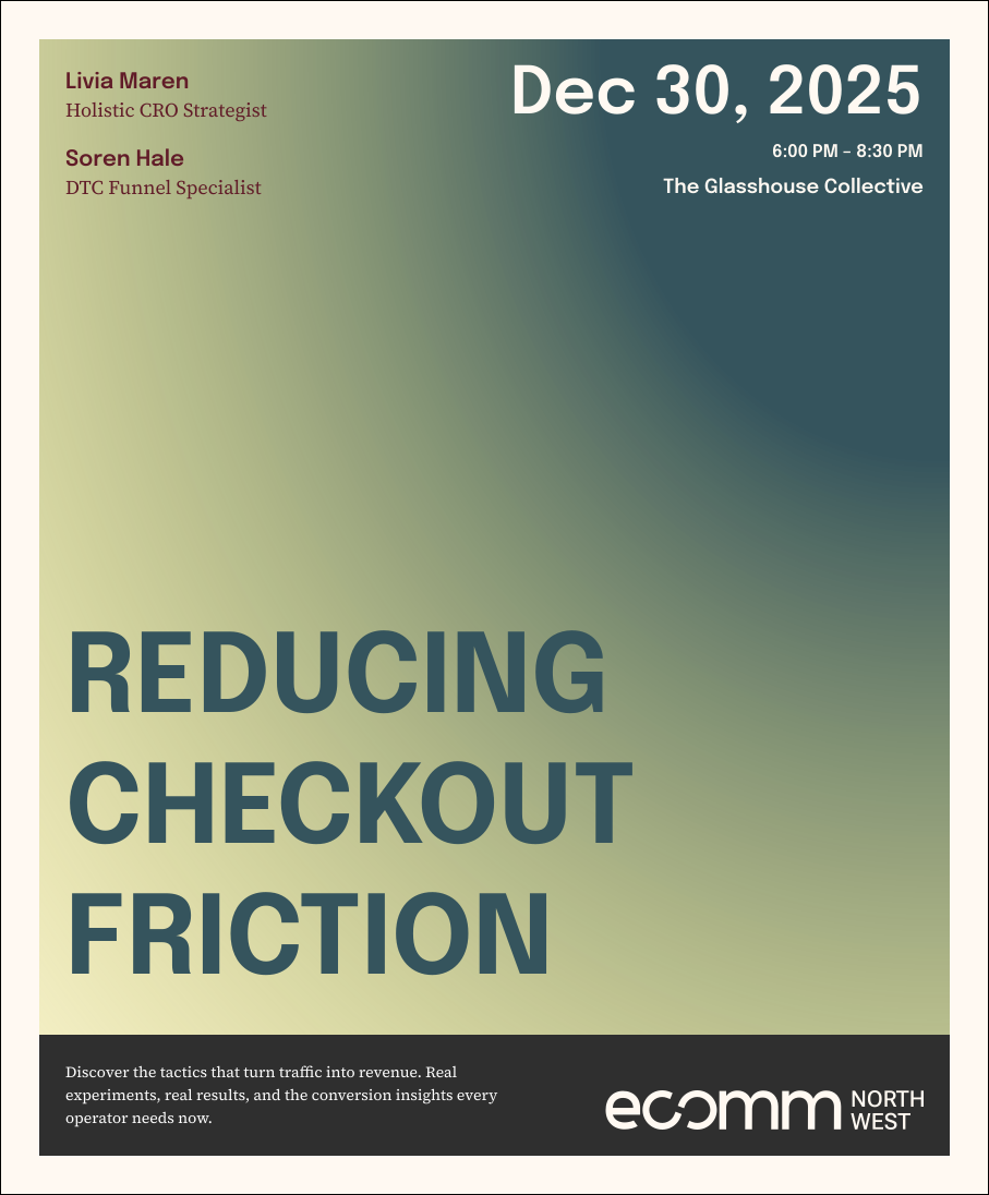
Large applications should work as finished artifacts: strong type, clear hierarchy, and just enough supporting copy to make the moment feel real.

Dark campaign artwork with a black-and-white Portland bridge image, reading Markets Move and Stories Travel.
Cream campaign artwork reading Grow, Real Stories, Real Community.
Dark campaign artwork showing where the energy goes: Exploration, Inspiration, and Ooh Shiny Things.
02

Social
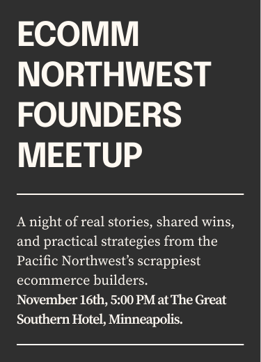
Systems

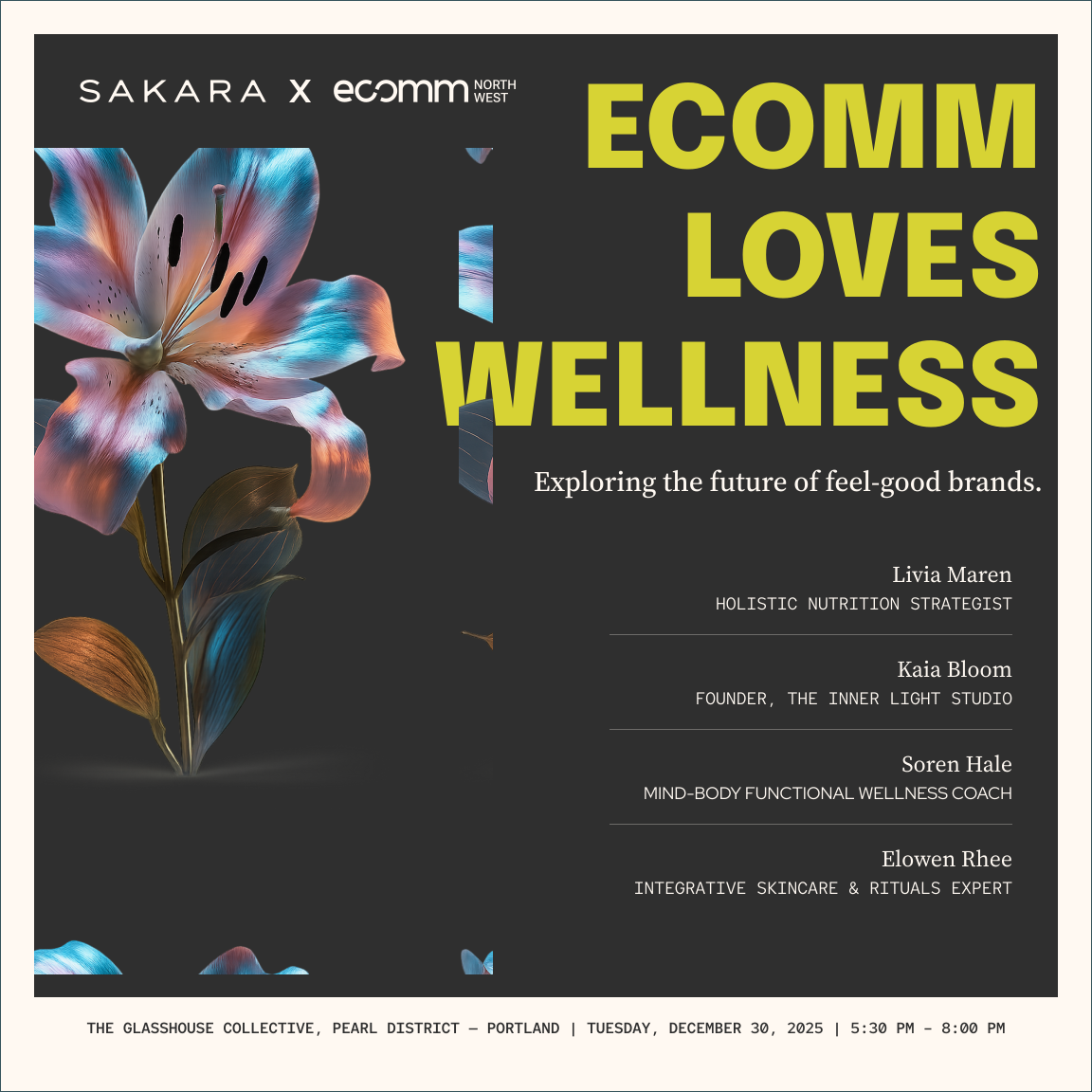
Social formats can use fewer elements and stronger contrast. Keep the writing human and let each card do one job.

03

Website
Hero

For web layouts, keep the logo readable, navigation restrained, and the headline oversized enough to create a clear first impression.

Light website hero example with Exploration headline, navigation, body copy, and buttons.
04

Voice
In Use

Voice examples belong here when they are shown as finished public-facing artifacts. Keep the full rules and writing guidance in the Voice section.

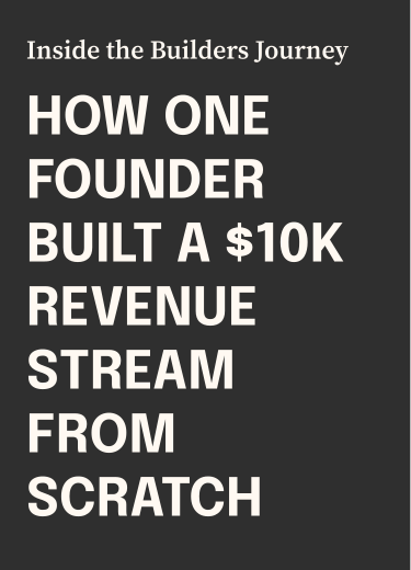
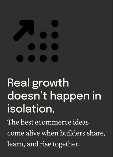
Tone of voice example card one.
Tone of voice example card two.
Tone of voice example card three.